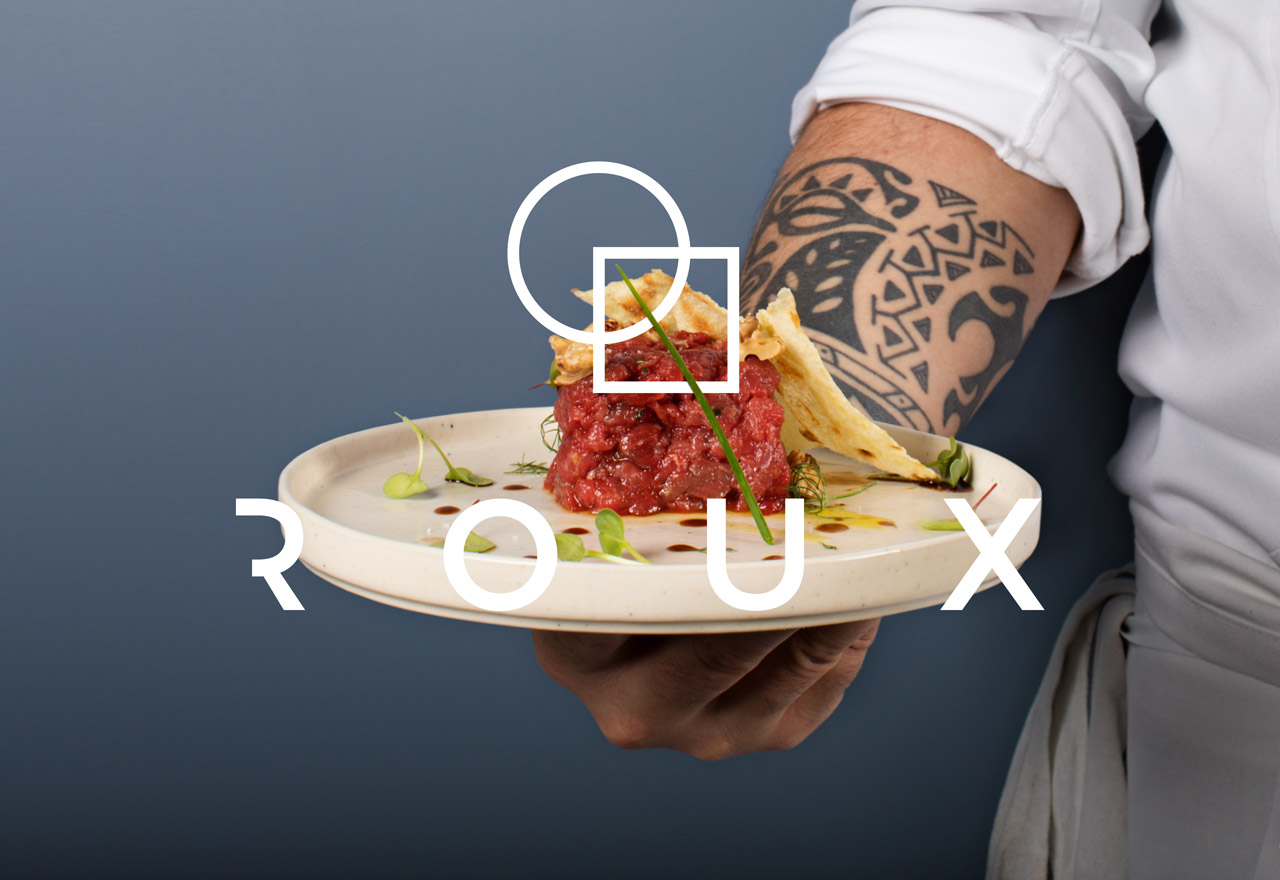
Roux
The south in Milano
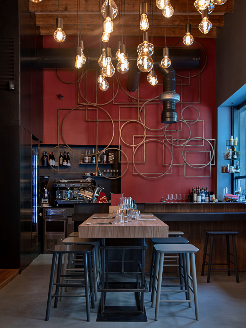
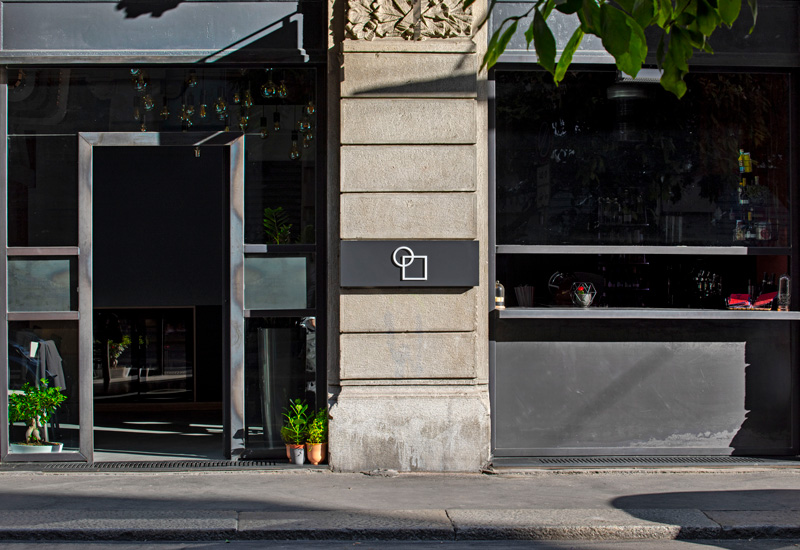
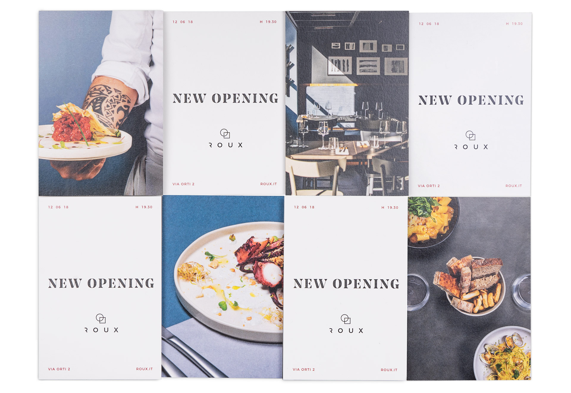
A city centre restaurant designed by the firm Alalda. We worked alongside the architects to define an integrated identity.
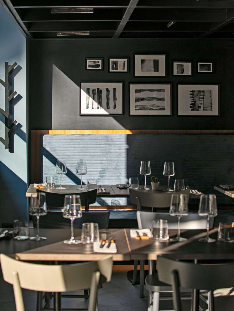
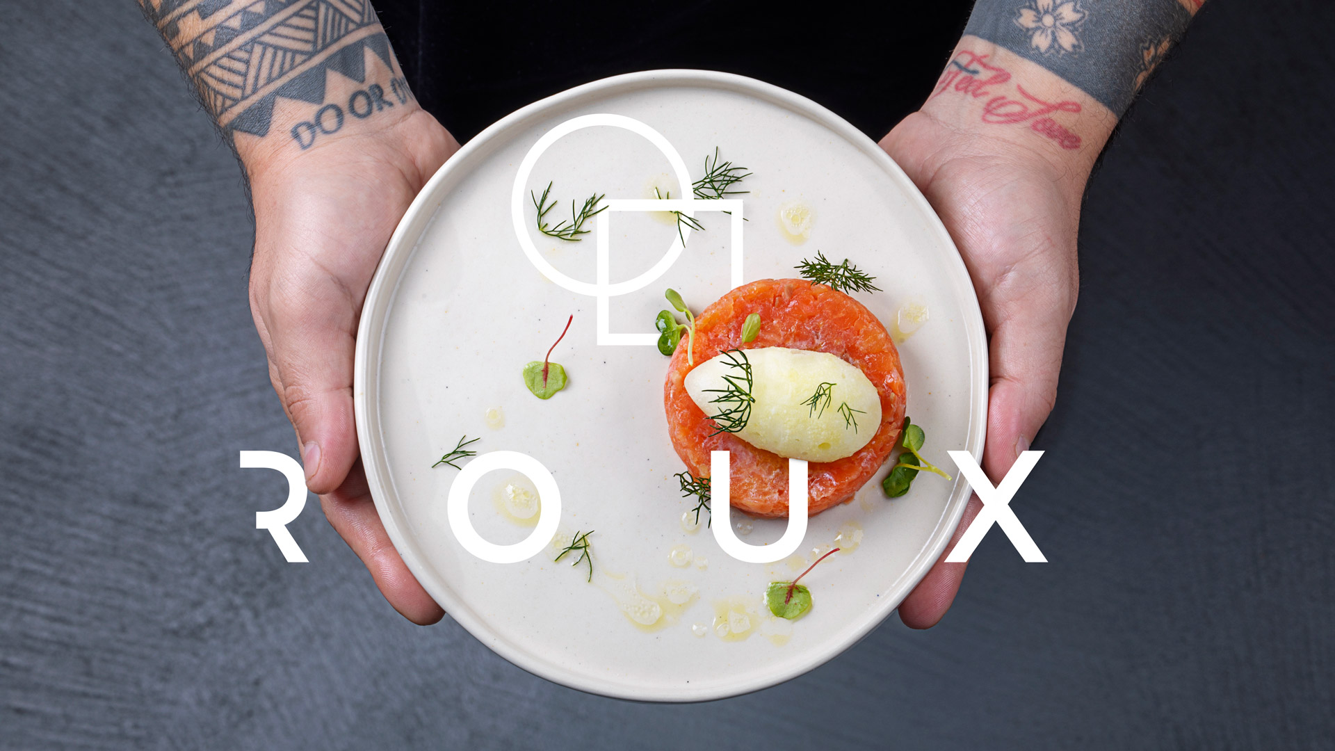
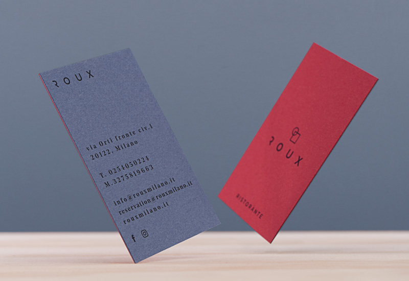
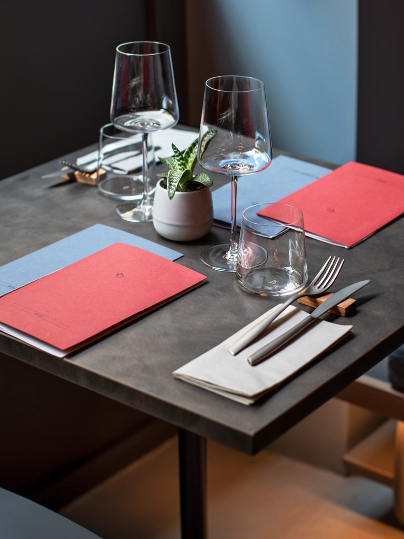
The environment drives the whole identity system. A minimal logo, inspired by the cafeteria's wall pattern, is central and is coupled with a linear Gotham typeface to generate a refined and effective combination.
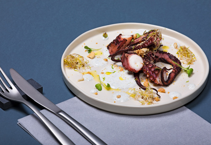
A set of shootings highlights the dishes as they come out of the kitchen every day. These where the base to set up a both digital and postcard campaign to prompt the opening.
TYPE:
Brand design
YEAR:
2018
CREDITS:
Abcproduction +